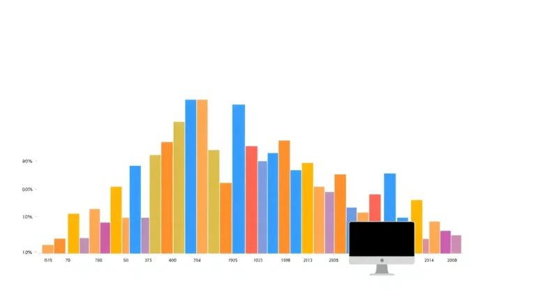
How to set plot titles and axis labels in matplotlib in Python

How to set plot titles and axis labels in matplotlib in Python

Customizing axis labels enhances data visualizations by providing context and clarity. Specific terms, appropriate units, and effective scales improve interpretation. Techniques such as rotating labels, adding reference lines, and incorporating tooltips enrich the user experience. Tailoring labels to audience expertise ensures better comprehension and retention.
How to generate scatter plots with matplotlib.pyplot.scatter in Python

How to generate scatter plots with matplotlib.pyplot.scatter in Python

Customizing scatter plots in matplotlib enhances data visualization. Key features include changing marker shapes with the 'marker' parameter, adjusting colors using the 'c' parameter and colormaps, and modifying point sizes with the 's' parameter. Transparency can be managed with 'alpha' for overlapping points. Proper labels and gridlines improve clarity.
How to construct histograms with matplotlib.pyplot.hist in Python

How to construct histograms with matplotlib.pyplot.hist in Python

Weighted histograms assign importance to data points, revealing distribution nuances in surveys or simulations. Two-dimensional histograms and hexbin plots visualize joint distributions, overcoming overplotting. Techniques include cumulative histograms, error bars for uncertainty, variable-width bins, and animated interactive plots for dynamic data analysis.
How to build bar charts using matplotlib.pyplot.bar in Python

How to build bar charts using matplotlib.pyplot.bar in Python

Customize bar charts with features like width adjustment, gridlines, and value annotations to enhance readability and visual appeal. Use the width parameter in plt.bar() to control bar width, and enable gridlines with plt.grid() for reference points. Annotate bars with plt.text() for immediate value context, and apply styles with plt.style.use() for a polished look.