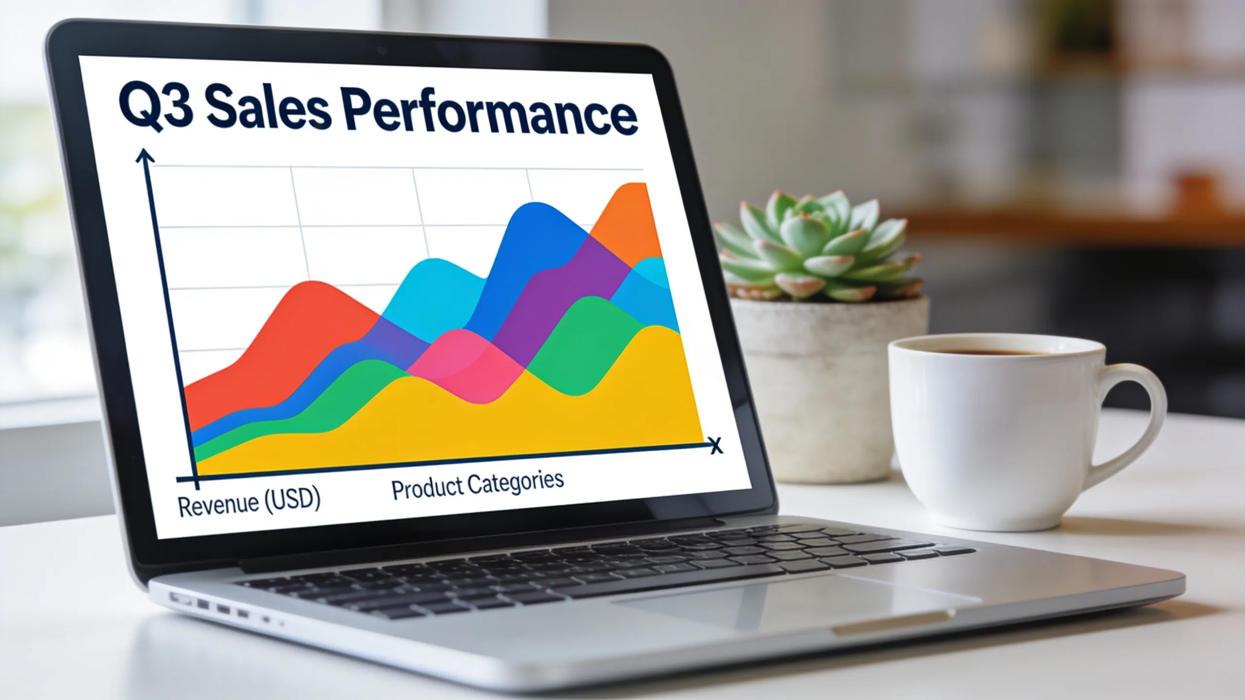
Titles and labels serve as the backbone of any data visualization. They provide context, guide interpretation, and influence the viewer’s understanding. A well-crafted title can encapsulate the essence of the data being presented, while a label offers clarity to specific data points. If either is vague or misleading, the entire visualization risks being misinterpreted.
When constructing visualizations, it’s essential to consider how titles and labels can enhance the message you want to convey. For instance, a simple title like “Sales Data” lacks the necessary detail to inform the viewer about what aspect of sales data is being analyzed. A more descriptive title, such as “Quarterly Sales Data by Region for 2023,” immediately provides clarity and context.
Using programming languages to automate the process of creating titles and labels can significantly improve efficiency. Here’s a simple example in Python using Matplotlib:
import matplotlib.pyplot as plt

data = [1, 2, 3, 4, 5]
plt.plot(data)
plt.title('Quarterly Sales Data by Region for 2023')
plt.xlabel('Quarter')
plt.ylabel('Sales in USD')
plt.show()
In this example, the title succinctly summarizes the data focus, while the axis labels clarify what each axis represents. This structure not only improves readability but also enhances the effectiveness of the visualization.
Another critical aspect of titles and labels is their role in accessibility. Descriptive titles and labels help ensure that your visualizations are comprehensible to a broader audience, including those who may not have the same background knowledge as you. This inclusivity is vital in fostering a data-driven culture within an organization.
When you go a step further and customize them based on the audience, it can lead to even greater engagement. Think about the differences in terminology that might resonate with various stakeholders. For example, a financial analyst might appreciate detailed metrics, while a marketing team might prefer broader trends.
Consider the following code snippet that dynamically changes labels based on the target audience:
def customize_labels(audience):
    if audience == 'finance':
        return 'Revenue (in millions)', 'Time (in quarters)'
    elif audience == 'marketing':
        return 'Sales Growth (%)', 'Period'
    else:
        return 'Value', 'Index'

x_label, y_label = customize_labels('marketing')
plt.xlabel(x_label)
plt.ylabel(y_label)
This approach not only saves time but also ensures that the presentation of data aligns with the audience’s expectations. Ultimately, the goal is to create a narrative through your visualizations that speaks directly to the viewer’s needs.
Investing time in crafting thoughtful titles and labels goes beyond mere aesthetics; it enhances communication and fosters a deeper understanding of the data. It’s a small effort that can yield significant dividends in how your data is perceived and used.

iPhone 17 16 15 Charger Fast Charging 10FT - 20W USB C Charger Block with 10FT Type C to C Cable Compatible with iPhone 17/17 Pro/17 Pro Max/Air/16/16e/15, iPad Pro, iPad Air (White)
$9.90 (as of July 6, 2026 13:48 GMT +00:00 - More infoProduct prices and availability are accurate as of the date/time indicated and are subject to change. Any price and availability information displayed on [relevant Amazon Site(s), as applicable] at the time of purchase will apply to the purchase of this product.)Configuring titles for clarity and impact
When dealing with complex datasets, customizing titles and labels becomes even more crucial. The clarity of your visualizations can be compromised if the titles do not reflect the nuances of the data. For example, if you have multiple datasets being compared, a title like “Comparison of Metrics” can be too vague. Instead, a title such as “Year-over-Year Comparison of Revenue and Expenses for 2022” provides immediate clarity on what the viewer should focus on.
Furthermore, using dynamic elements in titles can enhance the user experience. By incorporating variables that reflect the current state of the data, titles can be made more relevant. That is especially useful in dashboards where data is frequently updated. Here’s how you might implement this in Python:
import datetime

def update_title(data_source):
    current_date = datetime.datetime.now().strftime('%Y-%m-%d')
    return f'{data_source} as of {current_date}'

title = update_title('Monthly Sales Report')
plt.title(title)
This code dynamically generates a title that includes the date of the report, making it clear when the data was last updated. Such practices not only improve clarity but also instill confidence in the data being presented.
Consider also the aesthetic aspects of titles and labels. While clarity is paramount, presentation matters too. Using appropriate font sizes and styles can draw attention to key areas of your visualization. In Matplotlib, you can customize font properties like this:
plt.title(title, fontsize=14, fontweight='bold')
plt.xlabel('Quarter', fontsize=12)
plt.ylabel('Sales in USD', fontsize=12)
By adjusting the font size and weight, you can emphasize important information and create a hierarchy within your visualization. That is particularly useful when presenting to stakeholders who may quickly scan for key insights.
Another technique is to incorporate color into your titles and labels. Color can convey meaning and highlight important aspects of the data. For example, using red for negative trends and green for positive trends can provide immediate visual cues. Here’s how you might set colors in your labels:
plt.title(title, color='blue')
plt.xlabel('Quarter', color='green')
plt.ylabel('Sales in USD', color='red')
In doing so, you not only enhance the visual appeal but also create an intuitive understanding of the data’s implications. The use of color should be deliberate and consistent to avoid confusion.
As you refine your approach to titles and labels, consider the impact of localization as well. If your audience is multilingual, providing titles and labels in multiple languages can significantly increase accessibility and understanding.
def localize_labels(language):
    if language == 'es':
        return 'Ventas en USD', 'Trimestre'
    else:
        return 'Sales in USD', 'Quarter'

x_label, y_label = localize_labels('es')
plt.xlabel(x_label)
plt.ylabel(y_label)
This level of customization ensures that your visualizations are not only clear but also inclusive. In a globalized environment, the ability to cater to diverse audiences is a distinct advantage.
Finally, as you work on your titles and labels, remember to maintain consistency across your visualizations. Consistent terminology and formatting help reinforce understanding and make it easier for the audience to follow your narrative. This consistency should extend to the choice of color schemes, font styles, and even the structure of the titles themselves. By establishing a coherent visual language, you create a more professional and polished presentation that resonates with your audience.
Customizing axis labels for better data representation
Customizing axis labels is a key element in making data visualizations informative and engaging. The axis labels should not only describe the data but also provide context that aids in interpretation. For example, instead of using generic terms like “Value” on the y-axis, consider specifying what that value represents, such as “Revenue (in millions)”. This level of detail helps the audience quickly grasp what the data signifies.
Moreover, the choice of units in axis labels can greatly influence how the data is perceived. Using appropriate scales, such as logarithmic for exponential data, can reveal trends that are not visible on a linear scale. Here’s an example of how to set a logarithmic scale in Matplotlib:
import numpy as np

x = np.linspace(1, 100, 100)
y = np.exp(x)

plt.plot(x, y)
plt.yscale('log')
plt.xlabel('Input Value')
plt.ylabel('Exponential Output (log scale)')
plt.title('Exponential Growth on a Logarithmic Scale')
plt.show()
This approach not only clarifies the relationship between the variables but also makes it easier to identify patterns in the data. It’s an essential technique when dealing with data that spans several orders of magnitude.
Another important consideration is the alignment and orientation of axis labels. For instance, when dealing with long labels, rotating them can prevent overlap and improve readability. Here’s how you can rotate the x-axis labels in Matplotlib:
plt.xticks(rotation=45)
This simple adjustment can make a significant difference in how easily your audience can read and understand the information being presented. Additionally, ensuring that labels are not cluttered will enhance the overall clarity of your visualization.
In some cases, you may want to include additional context in your axis labels, such as reference lines or benchmarks. For example, displaying a target value alongside actual performance can provide immediate insights into whether goals are being met. Here’s how you might implement this:
target_value = 100
plt.axhline(y=target_value, color='r', linestyle='--', label='Target Value')
plt.legend()
This code adds a reference line to the chart, visually indicating where the target lies in relation to the actual data. It’s a powerful way to emphasize performance against expectations.
Furthermore, incorporating tooltips or hover text can enrich the user experience, especially in interactive visualizations. This feature allows users to gain deeper insights by providing additional information on demand. Here’s a basic example using Plotly:
import plotly.express as px

df = px.data.gapminder().query("continent == 'Oceania'")
fig = px.scatter(df, x='gdpPercap', y='lifeExp', text='country')
fig.update_traces(textposition='top center')
fig.show()
In this example, hovering over data points reveals the country name, adding an extra layer of interactivity that can engage viewers more effectively.
As you adjust your axis labels, keep in mind the audience’s familiarity with the data. Technical jargon may alienate some viewers, while oversimplification can undermine the depth of the analysis. Striking a balance very important. Tailoring your labels based on audience expertise can enhance comprehension and retention.
Finally, always remember to test your visualizations with real users. Gathering feedback can help identify areas where labels may be unclear or misleading. This iterative process ensures that your visualizations are not only aesthetically pleasing but also functionally effective in communicating the intended message.